this post was submitted on 22 Jun 2023
38 points (97.5% liked)

Programming.dev Meta

2365 readers
4 users here now

Welcome to the Programming.Dev meta community!

This is a community for discussing things about programming.dev itself. Things like announcements, site help posts, site questions, etc. are all welcome here.

Links

Credits

founded 1 year ago
MODERATORS
38
New Community Icons (programming.dev)
submitted 1 year ago* (last edited 1 year ago) by [email protected] to c/[email protected]
 

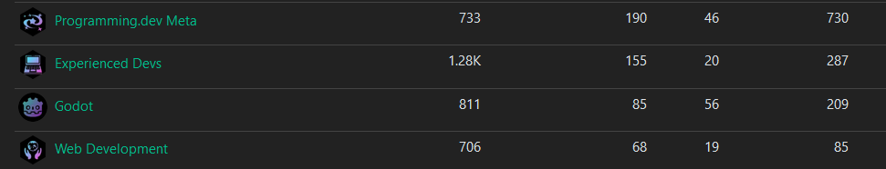
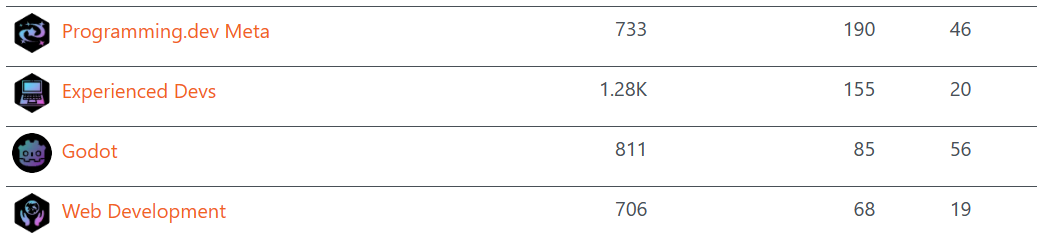
Ive been working on some unified icons for the instance so the icons feel like they belong together

Let me know if you like them or if there's some adjustments I should make

Some examples from ones I've done

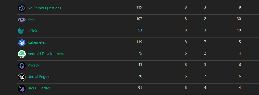
The majority of them are generated from https://game-icons.net/ with the settings of foreground being shrunk twice and position being x:2 y:2. Foreground color is diagonal from 2EE5D2 to A01FC5. And has a shadow with color 423025 and blur set to 15. The background color is just black

top 19 comments
sorted by: hot top controversial new old
[–] [email protected] 6 points 1 year ago (1 children)

These are awesome! One thing I like about beehaw is their visually consistent icons. It’s great we’re planning to have them as well.

I’m terrible at graphics so I used Midjourney to create the icon and background for [email protected] but I must admit they turned out pretty bad.

If it’s not too much trouble, would you consider making an icon for us too?

[–] [email protected] 5 points 1 year ago (1 children)

Sure I made one for your community and added it

[–] [email protected] 3 points 1 year ago

Thank you, it's really cool, I like it!

[–] [email protected] 5 points 1 year ago* (last edited 1 year ago) (1 children)

Did some more tweaking to the colors to make them work a bit better on light theme and ive got the foreground colors now set to 2FFDFD and F144D5

[–] [email protected] 4 points 1 year ago* (last edited 1 year ago)

Wow! Looks great and super easy to do. Just made one for [email protected]

I also like the cohesion between the communities on an instance.

[–] [email protected] 5 points 1 year ago (1 children)

These are great! It's cool to get a feel for which instance the community is from at a glance

[–] [email protected] 3 points 1 year ago

Yeah, Beehaw is really on-point with the branding. Little honey hexes? No way we can beat that! But yeah, I really like the colorscheme. It matches the colorscheme a lot of programming tools use today (or at least a lot I use).

[–] [email protected] 5 points 1 year ago

Great work @[email protected], they look great.

Thanks for all your effort.

[–] [email protected] 4 points 1 year ago (2 children)

I really like the aesthetic of the local communities for general topic categories; great iconography!

For the lang communities, or communities for projects with widely recognizable or official logos, I'm not so sure about unifying those as well, as it could hamper the visual brand recognition and association of the community with its target focus. For example, with so many communities, it's kind of convenient to be able to quickly glance the list and pick out recognizable interests without even reading the multiple pages of search results or labeled lists.

That said, perhaps there is merit in going fully unified, as then remote subscribers could easily identify communities hosted from the programing.dev instance, a pattern that other instances like beehaw.org or lemmy.world have already set a UX precedent for.

However, beehaw does benefit from having a recognizable shape (a hexagon), along with a high contrast color pallet (black on yellow), making it easier to recognise silhouetted logos, given the high contrast, even at smaller resolutions no bigger than the subtitle font size in Lemmy's post feed. Admittedly, some of the black on purple gradients here look a little dark to read at font height scale.

[–] [email protected] 3 points 1 year ago (1 children)

I think we could also help some mods to find project artwork or logos that are textless, increasing their relative size for easier visual recognition. E.g.

Textless:

  • Docker's container whale
  • Android's iconic green robot head
  • Java's steaming cup of joe

Of course some icons are unavoidably text, like php, R, C/C++, etc.
But their also common enough to ID on sight given additional color cues.

[–] [email protected] 2 points 1 year ago* (last edited 1 year ago) (1 children)

Java coffee? No way, we should use Duke!

I'm actually fine either way, I just have a soft spot for weird mascots, like the 1996 Olympics mascot Izzy.

[–] [email protected] 2 points 1 year ago

I guess it was officially “open sourced” under a BSD license, but I still mentally associate that mascot with 💰 Oracle:

[–] [email protected] 3 points 1 year ago* (last edited 1 year ago) (1 children)

Do these icons seem better to read? (the ones other than godot have the new style). Gave them a rotated hexagon background + made the colors lighter

[–] [email protected] 3 points 1 year ago

I think circles are better. While circles don't pop out as much as cropped polygons, I think they still fit better with the general web ecosystem of avatars and profile icons. Not to mention they allow for a slightly larger canvas size for artwork already circle cropped by Lemmy-UI's CSS .

It would be cool if Communities could be rounded squares, and reserve circles for users, just like github orgs vs github users. That could help with readability between the two when skimming icons in lemmy's page feeds. But perhaps that should be a user customization. As long as most artworks abide by best practices for maskable icons, then different lemmy clients, web UIs, mobile app launchers, etc, could crop however they like:

The new brighter colors do help. BTW, I do love rainbows. One thing you might want to try is once you've settled on a good saturation and value for readability, you could diversify the hue across different icons (with perhaps the hues for the gradients derived from the original/official logos/icon's color palette, if not too difficult to maintain), allowing local communities to be more readily distinguishable from each other at a glance, while still unified stylistically for our instance, sort of like a colorful android launcher icon pack?

Perhaps we could code up scripts to do this theming, so we could automate this procedurally? Similar to this art pipeline:

[–] [email protected] 2 points 1 year ago (1 children)

I hope you don't mind, I made one for the XR Dev community (made a banner as well). At first it had a different colorscheme as I didn't know about icon guidelines but now have updated it accordingly: https://programming.dev/c/xrdev

[–] [email protected] 2 points 1 year ago

Alright yeah that one looks great

There isnt technically icon guidelines yet until the icon poll in this post finishes https://programming.dev/post/190520

Once thats done ill be switching the communities like meta, programming, and the new ones over to whatever style wins

[–] [email protected] 2 points 1 year ago* (last edited 1 year ago)

I oppose this (for language icons). Check the App Icons section in stopthemingmy.app

load more comments
view more: next ›