this post was submitted on 09 May 2024
434 points (92.1% liked)
Programmer Humor
32233 readers
1000 users here now
Post funny things about programming here! (Or just rant about your favourite programming language.)
Rules:
- Posts must be relevant to programming, programmers, or computer science.
- No NSFW content.
- Jokes must be in good taste. No hate speech, bigotry, etc.
founded 5 years ago
MODERATORS
you are viewing a single comment's thread
view the rest of the comments
view the rest of the comments
I mean, I certainly wouldn't give someone else shit for using ligatures, but personally, I don't like them, because:
The IDEs I've used had the ligatures be of the same character width as the original operator.
Oh, yeah, I meant that it makes two characters into one big one, visually reaching across two or three widths, or just having one of the characters larger than the usual grid, e.g. in
:=the equals sign reaches into the width of the colon.This reminds me of a recent Microsoft font¹, so naturally here's a rant about that: They developed a feature, called "texture-healing", which basically allows characters that normally need to cramp into one monospace width, like
morw, to reach into the space of neighboring characters, if those neighboring characters are narrow, like ani.In theory, not a terrible idea, but then you get this kind of hate crime:
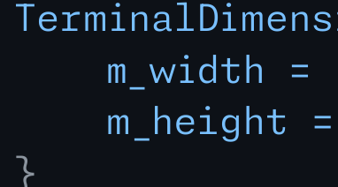
Obviously, might just be me again, but not having these letters align, just looks so much worse to me.
¹: It's this font: https://monaspace.githubnext.com/
Do you also get surprised when you backspace a tab and suddenly it removes more whitespace than 1 characters worth?
Or did you learn it fast and really never think about it?
I think it's more a "getting used to" thing, that once learned, you don't think about, but it makes things more readable.
Sure, I could get used to it. But it being more readable is not even true for me, because the thing I got used to instead, is that
!=is the unequals-operator. I see that much more often than≠.Studies show that ligatures improve readability, but I acknowledge that it's likely untrue for outliers.
For monospace fonts? I've heard of such research for proportional fonts, where ligatures definitely make sense to me. But yeah, I wouldn't assume such research to automatically translate to monospace.