this post was submitted on 23 Aug 2024
178 points (94.9% liked)
Data is Beautiful
852 readers
53 users here now
Be respectful
founded 3 months ago
MODERATORS
you are viewing a single comment's thread
view the rest of the comments
view the rest of the comments
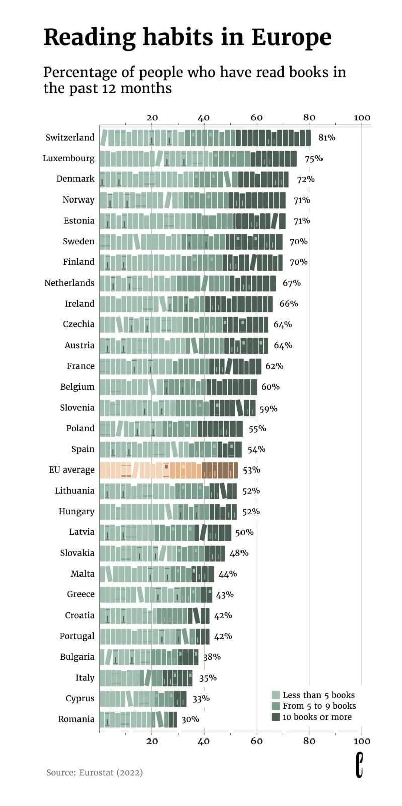
the color coding for the amount of books is the wrong way around. The classification with the lowest percentage should also come first on the x-axis. Right now you have to mentally subtract to get the percentages for people that read 10 books.